System Architecture Diagram
The following component diagram illustrates the full EOHA processing pipeline, from raw data source ingestion through the analytics engine to the output layer. It is drawn as a UML component diagram using the structured boundary-and-component notation.
Pipeline architecture
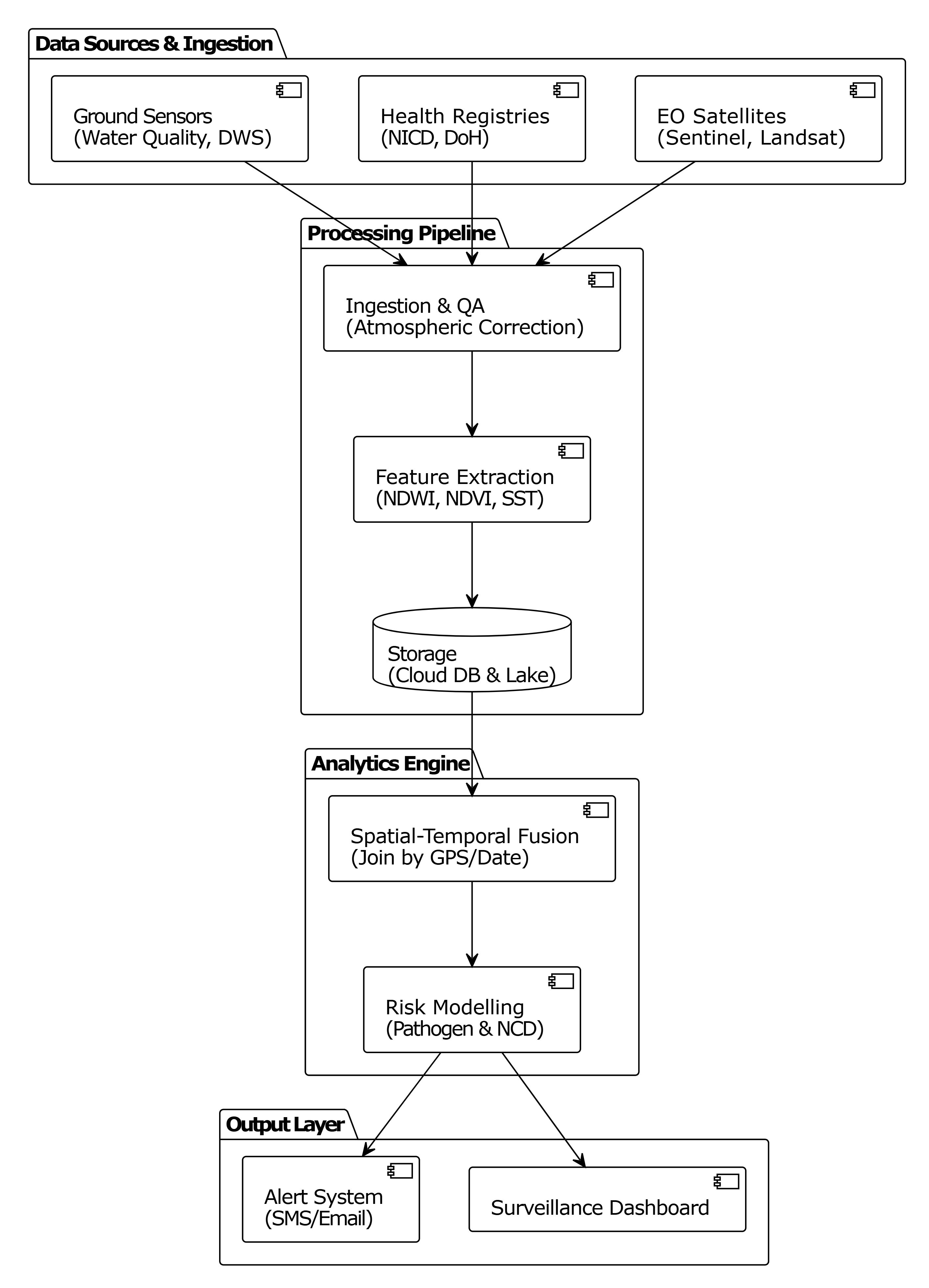
Layer breakdown
Data Sources & Ingestion
- Ground Sensors (Water Quality, DWS) — real-time physical sensor readings
- Health Registries (NICD, DoH) — national disease case reporting
- EO Satellites (Sentinel, Landsat) — multispectral imagery every 5–8 days
Processing Pipeline
- Ingestion & QA — atmospheric correction, cloud masking, schema validation
- Feature Extraction — computes NDWI, NDVI, SST (sea/surface temperature) from raw bands
- Storage — Cloud DB (PostgreSQL) + Data Lake (Google Drive / GEE Assets)
Analytics Engine
- Spatial-Temporal Fusion — joins raster outputs to administrative zone boundaries by GPS coordinate and date
- Risk Modelling — dual-stream pathogen (malaria) and NCD model producing probability scores
Output Layer
- Alert System — SMS/email notifications dispatched when
outbreak_probability_score > 0.80 - Surveillance Dashboard — interactive Leaflet map with choropleth risk overlays
Frontend system component diagram
The following diagram shows the internal component relationships within the frontend EOHA application — how the dashboard, module views, and data services interact.
Full design specification
The complete architecture is documented in the Design Specification Document v2.